
Responsive website built from provided mockups using a mobile-first approach.
Wanderlust is a responsive travel website built from a set of provided design mockups. The goal was to accurately translate those designs into a working website while maintaining consistency across screen sizes. This project focuses on front-end execution and real-world implementation, where developers are responsible for turning static designs into responsive layouts.
This project started with identifying the core features needed for a simple and reliable support system. The focus was on creating a clear structure that would allow users to submit requests and track their status without unnecessary complexity.
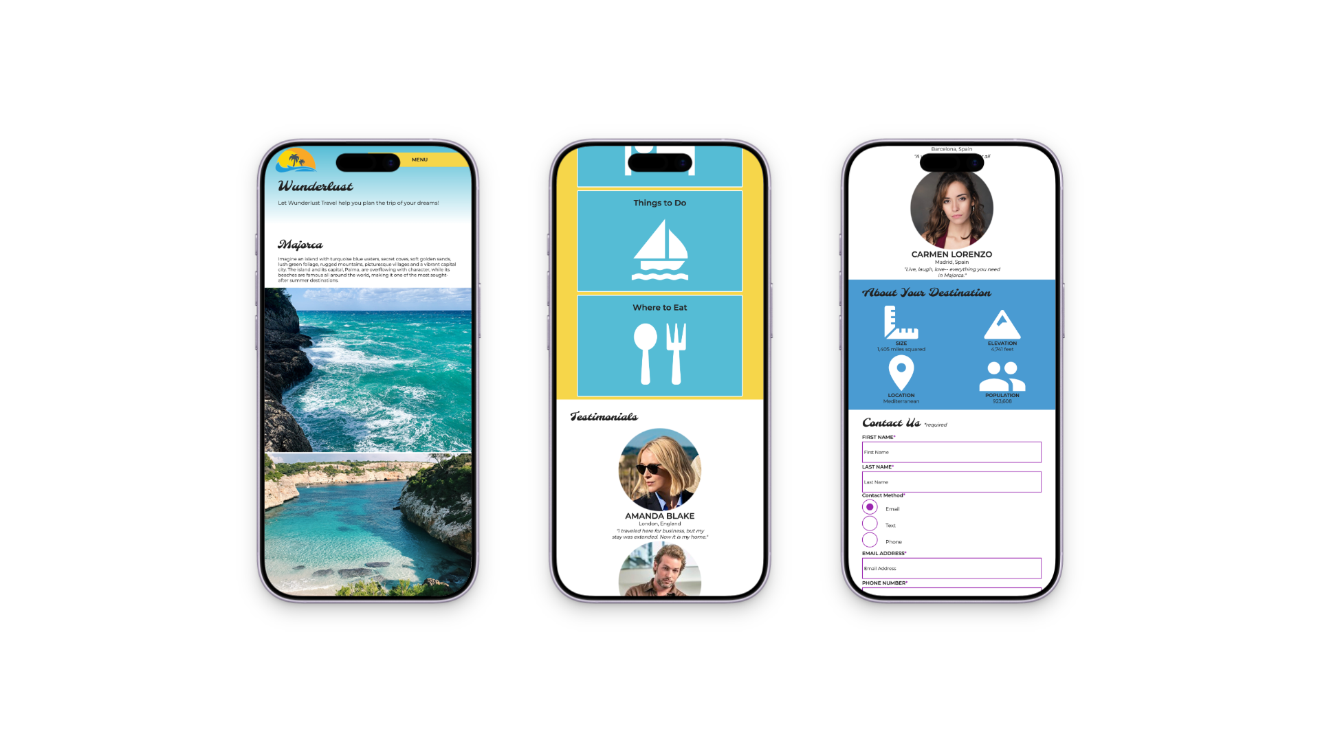
The build started with a mobile-first approach, focusing on smaller screens before scaling up. This helped establish a strong layout foundation and ensured that the design remained functional at all sizes.
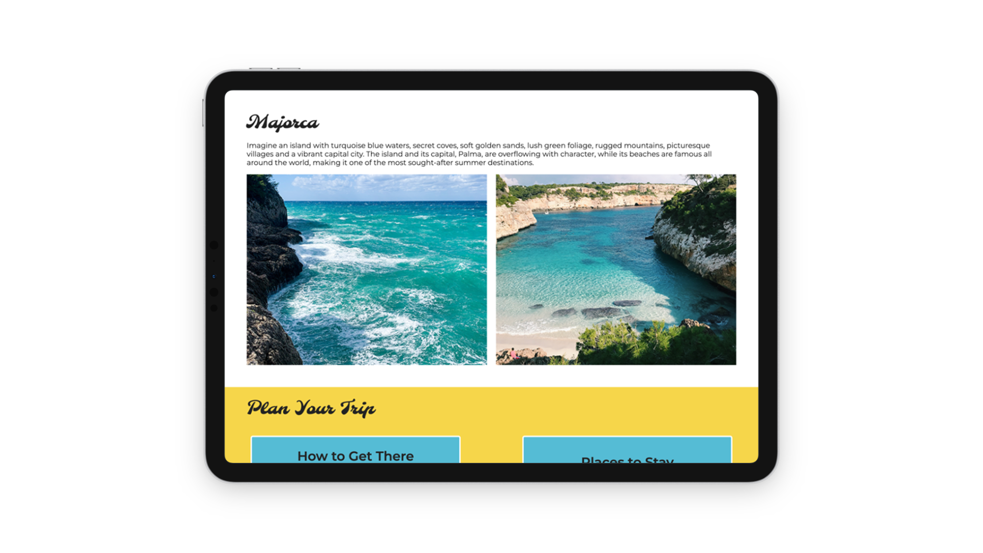
Media queries were used to progressively enhance the layout for tablet and desktop views. This allowed the design to adapt without breaking structure or spacing.
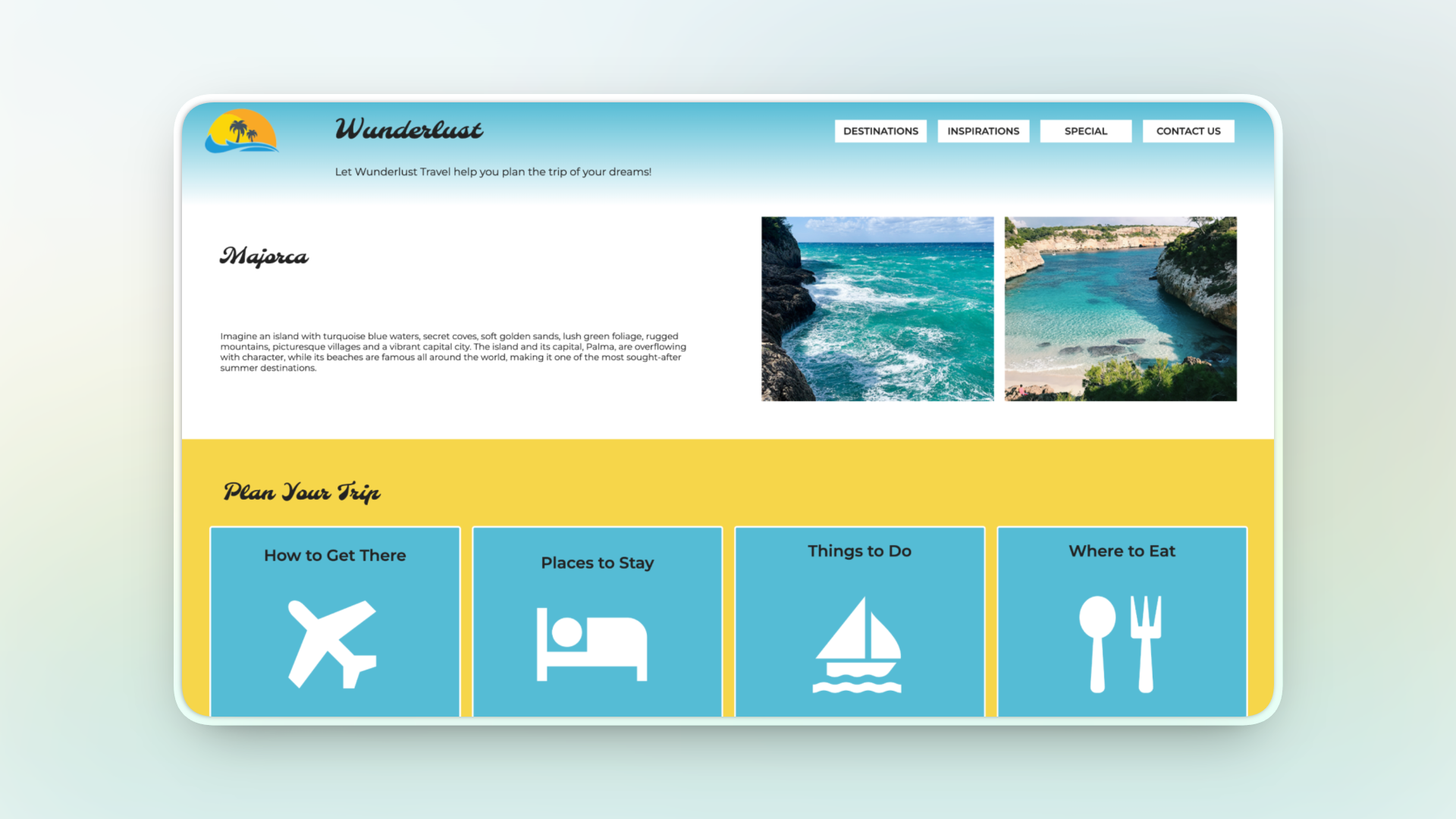
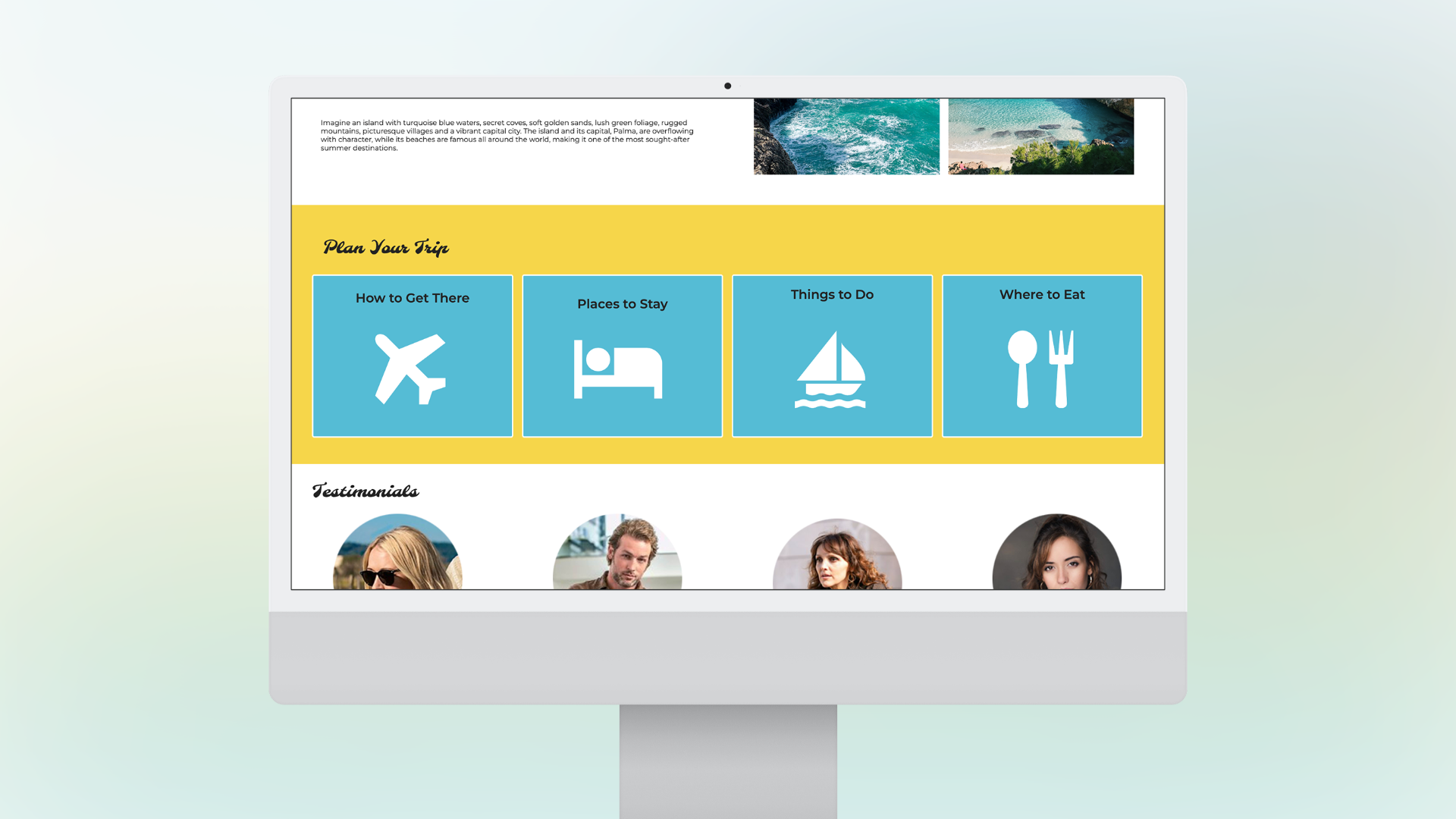
The final step was translating the full desktop layout from the mockups. This required careful attention to spacing, alignment, and visual hierarchy to match the intended design.
The final result is a responsive website that closely matches the provided design mockups and functions consistently across screen sizes. This project demonstrates my ability to translate static designs into working layouts while maintaining visual accuracy and responsiveness. It also reinforced the importance of mobile-first development and structured CSS.